


Measurement is not neutral about what it rewards. It prefers whatever sits closest to hand, and in product the things closest to hand are the tangible ones like conversion, retention, time on task, revenue per user. Countable this sprint, so we manage it this sprint.
And the intangibles wait outside in the cold.
Whether the product met the need someone arrived with, or whether it felt trustworthy. Whether the promise it makes on the first screen is still true by the last. None of these resolve to a clean number, and each asks something of you before you can read it at all, like a clear picture of the product and an honest understanding of the person using it. A lot harder than opening a dashboard. So it waits, and waiting turns into never, and the countable half wins the budget argument every quarter until nobody is left maintaining the other half.
And then eventually a substitution happens that no one consciously decides, and the business metric stops standing in for the experience and becomes the experience. Performance becomes the whole universe, and what the numbers show is treated as the only reality. What they cannot show is treated as absent. A team can hit every target on the board and still ship something nobody wanted, because the board was never able to see the want in the first place.
It’s not new, and it’s not unsolved
Service designers spotted the problem decades ago, and SERVQUAL, built in the late 1980s, reads quality as the gap between what a customer expected and what they perceived, across five dimensions. SERVPERF followed a few years later, arguing you could drop the expectation side and score perceived performance on its own. Both are rigorous, and both have held up for forty years.
They are also pretty hard to live with as they were designed for service encounters and periodic surveys. A long questionnaire after the fact, dimensions to reconcile by hand, a research project every time you want an answer. Few product teams will be able to run that every sprint, so they run nothing, and soon enough they drift back to the dashboard already open in the next tab. The old models were right about the problem, but they were built for a slower world than the one a modern product team ships in.
What a modern product team needs is something lighter, quick enough to live inside a normal cycle, plain enough that brand, product and research can read it without a manual, and still honest about the intangible.
Three truths, three gaps, and a pizza place
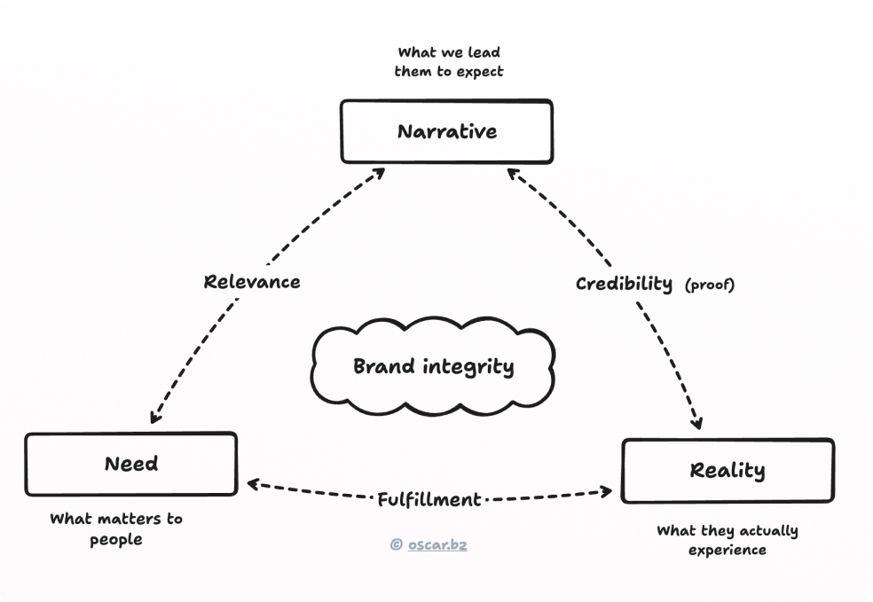
To get a clear picture, we just have to look at three simple truths side by side: Need → narrative → reality.
First up, the need, which is what matters most to the person, in their terms, never the action you wish they would take. Then, the narrative is what you lead them to expect, and it runs far wider than marketing: a screen that lays everything out and lets you compare is already promising you are in control here, without a word written. Finally, the reality is then what the person concludes is true after using the thing. Not whether the feature worked, but whether they came away confident, or lost, or quietly sold to.
The gaps between them are where you find the clues as to what’s really going on. Between need and narrative you find relevance – whether the story speaks to something the person values. Between narrative and reality sits credibility – whether the experience backs up what you claimed. And between need and reality you have fulfillment – does the product resolve what the person came for, regardless of what you said about it.
Close all three gaps and something materializes in the middle that none of them produces alone: brand integrity. It is the compound of a promise made well and kept, and like anything compound it builds on itself, a little more each time a person wants something, believes you will provide it, and finds that you did.
Treat the intangible like the tangible
The model only works, though, when you actively dispel the asymmetry that started all this. When the need, the narrative and the felt reality get measured with the same care and the same weight you give conversion and revenue.
They earned that weight because they decide whether the hard numbers still hold next year.
Reality can be read, but it has to be read per person and per context, because the same delivery lands differently depending on who meets it. Show every option and a confident user reads control, a newcomer reads overload, someone in a hurry reads I can’t tell what matters. One average score flattens those three into a number true of nobody. But when you score them apart, against what each person needed, then the intangible stops being a feeling and turns into evidence you can act on.
Eight states, and where to point next
Each truth is either strong or weak, and that gives you eight combinations, and every single one points somewhere different.
Three strong ones show coherent value, the state you want to protect. Strong need and narrative over a weak reality is a broken promise, the most dangerous on the list that no dashboard ever catches: the promise still lands on the surface while the delivery fails underneath, teaching every believer not to trust you next time. Strong need and reality with no narrative is a silent strength, value handed over without credit. And so on around the grid. Mend the delivery, tell the story, drop the claim, go find the need. Stop guessing what is wrong and start knowing where to aim.
None of this measures less – it just counts the thing the convenient number was always standing in for. Put the need back beside the narrative and the reality, give the intangible its full weight, and the dashboard returns to what it was meant to be: a proxy, and not the whole point.
Your intangibles were never actually unmeasurable – they were just unmeasured. That is a decision, made fresh every time an organization reaches for the nearest number because it is … near.

Hi, I’m Oscar - Founding designer at momondo, I’ve won a Material Design Award for Innovation, and I help design leaders succeed.