

While the last stragglers amongst designers still debate how AI might “augment” their process, your product manager two desks over is sketching wireframes over coffee, and your CEO who still asks the assistant to print their email is generating a passable prototype by typing a sentence into a box.
The thousand-intern army that AI is, can execute any direction you give it. Its own idea of creative inspiration is “what if this button were slightly bluer.” It’ll spin out a thousand variations of a layout until the moment you ask which one is better and why, and it will likely give you a very confidently bad answer.
So your value designer starts to move to the instinct that picks the one good option out of the thousand, and to something larger that we haven’t really named yet. Because this breaks the assumption underneath everything we do – that people move by hand through windows, icons, menus and pointers.
The WIMP model that built the profession is dissolving fast.
A comfortable forty-year run.
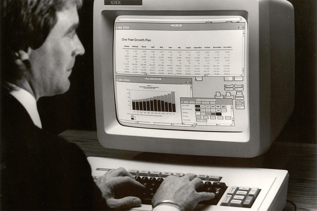
In 1981, Xerox unveiled the Star Information System and freed us from remembering commands that read more like incantations written by wizards. Suddenly your grandma could use a computer without a computer science degree. And the desktop metaphor they bundled everything into was so obviously right that we’ve never really questioned it since.
So for four decades, designers built whole careers becoming virtuosos of this one visual approach. We made windows feel like windows, complete with the satisfying snap when they lined up. We turned abstract functions into little icons your mom could read, and choreographed menus that revealed exactly what people needed exactly when they needed it.
As UX guru Jakob Nielsen points out, nearly every interface built after time follows the same WIMP style. We didn’t just adopt a pattern that worked – we internalized it until questioning it felt almost unthinkable, and got so good at working inside the limits that we stopped seeing them as limits entirely
Cracks become chasms.
WIMP was built for one reality: one person, one keyboard, one mouse, one fixed screen. It’s perfect for that and increasingly awkward for everything else. Voice was the first departure and hardly the apocalypse everyone predicted, because talking to your smart speaker is fine and debugging a stubborn CSS layout out loud is not. (Unless you’re one of those Wispr Flow freaks.)
We already have about ten million people walking around with the answer strapped to their face like the Ray-Ban Meta glasses. You ask them something and the answer arrives in your ear or across a lens. No window to open, no icon to tap, no menu to walk, no pointer to aim. The entire WIMP vocabulary is just absent, and nobody wearing them notices it’s gone. The Xerox Star team would either call it magic or assume someone had spiked their coffee.
Software like Siemens’s DesignCenter now watches which tools and commands you reach for, and in what order, and then reshuffles its own menus and toolbars to surface the ones you’re about to need. Netflix and Amazon have been doing a cruder version of this to their front doors for years. The interface simply reorganizes itself around you instead of waiting for you to hunt through it, which means interfaces are starting to have opinions about what you’ll do next.
AI as the interface designer.
And in the same way adaptive interfaces started taking control away from the user, AI is now taking over the design itself. It’s doing the interface design now, generating what gets rendered, per person, per moment.
Nielsen again describes generative UI as interfaces generated in real time to fit one user’s needs and context, and uses the example of an airline app that rebuilds itself for a frequent flyer with dyslexia: dyslexia-friendly type, her home airport already filled in, the red-eyes she never books hidden. That interface exists for exactly one person. Old GUI design was building a stage set, fixed for every performance. This is closer to directing improv.
Everyone’s answer to this is to point AI at the design system and let it assemble. Connect the component library, expose it over an MCP server, and the machine has everything it needs. Most teams racing to get AI-ready are doing exactly this and calling it done.
It doesn’t work though, and we know it doesn’t because it’s been tried already. One example from Yesenia Perez-Cruz, who led Polaris at Shopify for five years, was giving Claude Code full access to the Polaris library and its MCP server, every component and composition pattern the system had ever documented. Then she asked for a UI to confirm changes to a discount code. She got the resource detail layout with some styling to mark what had changed. Then she asked for a UI to extend the expiry date across thirty discount codes. She got the same resource detail layout, with a table dropped inside one of the cards.
Those are two completely different jobs, one person reviewing a single change and another editing thirty records at once, and the output came back nearly identical both times. The association between “discount” and “a page that looks like this” was strong enough that she couldn’t shake it loose, because the library told the model what a discount looks like and never told it what a discount is for.
The way out of the “more of the same” maze, is adding a semantic layer to the mix, rather than more components. Simple markdown describing the objects themselves, the surfaces they can appear on, and the signals that indicate what someone is trying to do. Now running that same model, same library, same two prompts, the confirmation came back as a compact modal with the changed values marked and an impact summary, because reviewing one edit doesn’t need a full page. The bulk request came back as a proper batch editing screen with the new end date called out in its own column, the density adjusted to the task.
And then something new: the AI composed a bulk date picker that didn’t exist anywhere in the library, reasoning that if you’re extending thirty dates you probably want to select them all and set the value once. The system now going beyond just re-using what had already been defined, and doing so with reason.
Even the way it narrated its own work changed. Without the context layer it listed what it had picked: a banner, an index table, checkboxes, a sidebar, status badges. With the context layer it named the intent, named the surface, and explained the decision.
Your component library documents appearance, which is the part the industry keeps missing. It says nothing about when a thing should be used, what the person is trying to accomplish, or which presentation serves that goal, because for forty years the designer supplied all of that from their own head at the moment of use. It never needed writing down. Hand the library to a machine and it fills the gap the only way it can, by reaching for the most statistically common arrangement and calling it a decision.
Feed the same machine your intent and it starts making choices you’d defend in a review.
“The uncomfortable truth is,”
Yes, seriously. Let’s be honest about what most of us do all day: we apply templates within constraints. We arrange existing elements along established patterns and dream of real creative work. We’re masters of variation inside fixed spaces, and none of that is a small skill, because there’s craft in making an interface feel effortless.
But when AI throws out thirty variations in the time it takes Figma to load, the market value of that pixel-perfect refinement collapses. Churning out asset variations, producing responsive layouts, A/B testing visual alternatives: generative tools already do all of it with inhuman speed and consistency.
“Junior designers are done. AI does thousands of icons in seconds. Only creative directors survive.” — Some design leader, probably.
The jobs that disappear are the ones defined by deliverables instead of outcomes and impact. The designer whose whole value is a beautiful static mockup is in trouble as teams move to live AI prototyping, and the UX lead who hand-documents every screen state will watch AI generate those states on the fly.
None of it is worth mourning though, because clearing out the old production roles opens room for harder work, and our new semantic layer is exactly the kind nobody currently owns.

The question now isn’t where you use AI, but where you don’t.
For a while the honest advice was that you had a few years to adapt before AI-driven design became the norm. That deadline came and went while nobody was watching.
Figma spent 2024 shipping its first AI features as opt-in extras you could ignore. By Config 2026 that framing was gone. Make turns a sentence into a working, editable prototype. An agent co-designs on the canvas. The tool checks your work for accessibility and hands structured code to engineering without being asked. None of it is a beta you switch on. It’s the floor, and clients already expect the iteration speed it buys. Apple, Google and Microsoft are baking AI-driven interface APIs into their design guidelines the way they once baked in responsive principles, so the baseline keeps rising underneath you whether or not you move.
As Bob Baxley put it (, and I’m paraphrasing here):
“AI is taking us from throwing spaghetti at the wall to see what sticks, to getting a spaghetti throwing machine that can do it much faster.”
Sure, it's an upgrade, but we're still solving the problem the wrong way, just making the mistakes faster.
Which is why the interesting question has flipped. It’s no longer whether you use AI, because everyone does, and the holdouts are already slower. The question worth your judgment now is where you deliberately don’t use it, and why. Which decisions you keep human on purpose. Where a generated interface is faster but quietly worse. Where personalization curdles into manipulation, or the efficient answer strips out the friction a person actually needed. Nobody audits a screen that only exists for one person and never renders the same way twice, which means the guarantees we used to check at the end now have to be built into the thing doing the generating. Knowing where to withhold the machine is turning into a sharper skill than knowing how to run it.
The move back to fundamentals is exactly what design needed, and plenty of designers will still refuse to make it, because arranging four elements on a screen is comfortable and owning how a system treats a million different people is not. And that’s the real split.
This article was edited July 2026 to add better examples, and now has a follow-up too:

Hi, I’m Oscar - Founding designer at momondo, I’ve won a Material Design Award for Innovation, and I help design leaders succeed.
i’ve been thinking a lot about this. We go from User adapts to interface to Interface adapts to intent