

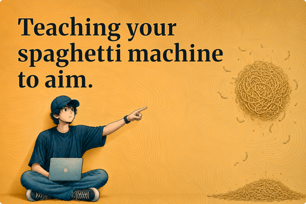
“AI is taking us from throwing spaghetti at the wall to see what sticks, to getting a spaghetti throwing machine that can do it much faster.”
– Bob Baxley
A designer recently joined us and spent three weeks making all the right moves to onboard: she read the system, sat in on reviews, asked good questions. Then she asked what a flight result actually is, and someone opened Figma and pointed at a component in the library.
This is certainly an answer to what it looks like, but it really doesn’t say which states the thing can be in, what’s legal to do to it in each one, which contexts it belongs in, or what happens to it when the trip it sits inside gets canned.
We have an answer for each and every one of those somewhere in the building, but none of them written down, because since the dawn of UI design, the only thing that ever needed to read our design decisions was another designer, and they could just ask us, or use common human sense and experience.
And that’s about to become the most expensive gap in your organization.
Directive screens, and what’s going to replace them.
Everything we design today is directive, meaning to get something done you go to a page, fill in fields, press a button, then go to the next page. We have a design system to supply the parts those pages are built from, which is why component libraries are the artifacts we’ve spent a years perfecting.
Intent-aware interfaces flip that completely on its head. Instead, someone states a goal or asks a question, and the system then works out what they’re trying to do from the words they used, the account they’re using, what they’ve done before, and how precisely they phrased it. Then, through the magic of AI✨, it composes a surface for that intent instead of just routing them to a page someone drew in advance.
The real difference shows up in the shape of what gets composed. “Move all my October flights to November” is a bulk operation, so it should give something built for reviewing forty changes at once, with the new dates called out in a column or something. “Which route gets me there cheapest in November” is exploratory and fluffy, so it should give me something closer to a canvas or map, built for comparing and wandering. The same underlying data, the same design system, two completely different things materializing on my screen, neither of which exists as a page in my Figma file today.
We’re already doing this in some paces. Ask an AI assistant for a recipe and you get a card with a timer that starts when you tell it to, and all the ingredients neatly stacked by order of when you need them. Ask it to prioritize your week and you get a sortable list. Ask it to draft a message and you get an editable box with alternative ways to write something. No-one designed that recipe page, the priorities page or the drafting one. The system simply recognized three different intents and assembled three different surfaces for those.
The middle ground was always the ceiling
When we work with fixed screens, we’re forcing a compromise that we’ve gotten so used to, we stopped noticing it.
What people need varies enormously and going with a single layout can only serve a single point on that axis. On the first use a person wants guidance and focus. On the one hundredth, that same person now wants density, shortcuts, and maybe even settings. A traveler booking a single flight and an agent moving forty passengers around are using the same screen with wildly different needs. And since we haven’t been able to magically adapt at scale, everyone gets the average of all of them, which runs too slow for the expert and demands way too much precision from the beginner. You end up with something that takes the confusion of the power user interface, and the limitations of the beginner’s.
And we happily shipped that for decades and called it best practice, because there wasn't really an alternative. But that interface can now be assembled per person (and per moment), so the compromise has stopped being a constraint and turned into a choice instead. What stands between you and the alternative is that the thing doing the assembling has no idea what any of the things in your product are.
The layer no-one has written.
In Death of a WIMP Designer, I wrote about an example of this, and its solution. A model with complete access to Shopify’s Polaris library - every component and composition pattern they had ever documented - was asked to build two very different things: a confirmation for one small change, and a bulk edit across thirty records. It produced nearly the same layout twice. The library told it what a discount looks like, but never told it what a discount is for.
But when we add a second layer of documentation, the same model suddenly gives us a compact modal for one and a batch editing screen for the other.
That new layer is the whole ballgame, and almost no-one has it.
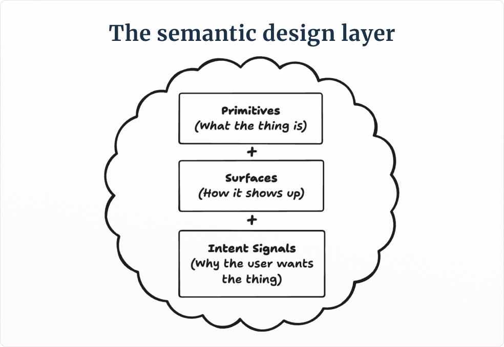
This semantic layer has three core parts to it:
First, your primitives, which are the abstract “things” people actually create and manipulate - these are your whats. It could be a flight result, a trip, a traveler, a fare alert, or a booking. Every product you’ll build has fewer than ten of them and yours have probably never been written down anywhere. Each one has its own little aura or signifier, meaning how a person recognizes it wherever it turns up, along with its essential fields, its states, the transitions and actions that are legal between them, and what it sits above and below it in the greater hierarchy.
Second, you’ve got your surfaces, which are containers rather than pages, or components. These are your hows - how the primitives appear and react to actions or data saturation, and make sense for the end user. A batch surface for many objects at once. A discovery surface for someone who doesn’t yet know what they want. Each one documented with its purpose and which primitives it’s meant to have squeezed inside it. These are essentially all the variants you can think of for what we call components today, but meant for a different consumer.
Third, you have intent signals, which is the part everyone seems to skip. A brand-new account opening trips for the first time signals learning and onboarding opportunities. A request naming a date range and forty records signals bulk work and “get out of my way”. The number of of “things” someone already has done or created signals their experience with the product. Write those down and the composition stops being a guessing game.
Objects then become the material.
With directive design, we place inputs at the center, because the fields and buttons were what people touch. When people stop touching them, the object itself becomes the thing you’re designing, and it now has to survive being rendered anywhere it pleases.
In my case, I’ll go and find every place a flight result currently appears. Search, comparison, trip planning, confirmation, price alerts, a fare-drop email, whatever our AI assistant renders when someone asks in plain language, and then put them in a nice long row row, which almost nobody does, since they were built by different people at different times against different deadlines and KPIs, and who’s got the time for this anyway? Some lead with price and some with duration, some have a button, some don’t. The layover is a number here and a graphic over there. The carrier logo appears on five of them and not the other three for some reason.
And don’t get me wrong - it’s not that the designers that did all these made a wrong call. The “thing” is incoherent across the whole product anyway, so it was never a quality problem that more review was ever going to fix. And when we juggle around with an object with no real true definition, it ends up being defined locally by every surface that needs it, and local definitions tend to drift. It’s like a game of telephone, but instead of a funny sentence at the end, we get crippling tech debt. When a human is drawing up all your screens manually, we can mitigate that, but when a machine is composing surfaces you never saw, this becomes the thing that makes or breaks.
Which means the objects (things) in our product need the same level of attention we currently reserve for our buttons and sheets.
So who owns which bit?
The split that makes this work in an org is like grammar against vocabulary, and we can map it onto teams we already have.
Design systems own the grammar. Which surfaces exist in this product at all, the metadata every primitive has to carry around with it, how objects nest inside each other, and the signifier (aura, fingerprint, whatever) system. Vertical (or problem space) teams then own the vocabulary. These are the fields, the business rules, the states, the relationships and contracts between the “things”.
When we combine them, the system can finally start composing sentences.
Chances are, in most organizations, this work belongs to nobody right now, because it’s too product-specific for the systems team and too systemic for any single product team, and it sounds really long-winded and heavy, and those A/B tests aren’t going to magically produce themselves. But someone’s got to grab it.
The cheapest place to start needs no AI at all. You take your most important object and check how it’s identifiable across every surface it jumps into, and then make it consistent. This is the crucial, but boring work the vibe bros don’t tell you about in their tutorials. You need to get your hows, whys, and whats into great shape before you can build understanding and agency in your system.
But, here’s the but.
Muscle memory is real, and any surface (UI) that quietly rearranges itself - however clever the it might be around that shuffle - is essentially hostile. The thing to zero in on is whether that adaptation answers something the person asked for, or if the system just kind of watched them and decided on its own.
And, truth be told, this is the part we’ve yet to figure out.
We can see the evolution happening, clear as day. That isn’t in question. Screens gave way to pages, pages are giving way to surfaces composed on demand, and the tools to do it are already in your stack. What we can and should question is whether the service composing them knows what your product is made of, or has to guess from the pictures you left scattered all over the place.
And the only one who can piece this together is you.
This article is the fourth in my AI series and a direct follow-up to part 3:
Death of a WIMP designer

While the last stragglers amongst designers still debate how AI might “augment” their process, your product manager two desks over is sketching wireframes over coffee, and your CEO who still asks the assistant to print their email is generating a passable prototype by typing a sentence into a box.


Hi, I’m Oscar - Founding designer at momondo, I’ve won a Material Design Award for Innovation, and I help design leaders succeed.